Overview
SpainLomat partnered with Digital Priority to refresh and redefine its identity as part of a wider website renewal. The objective was to create a timeless, modern visual identity that reflects SpainLomat’s core values: trust, local expertise, and the relaxed lifestyle of Spain’s Costa del Sol.
The rebrand focused on clarifying the brand’s message, elevating its visual language, and ensuring consistency across digital touchpoints — without losing the warmth and approachability that define SpainLomat’s service.
01 — Project Scope
Digital Priority led the full rebranding process, including:
- Brand strategy alignment
- Logo redesign
- Visual identity system
- Digital brand application
- Website‑ready visual assets
The goal was to modernize the visual look while preserving recognition and credibility built through years of operation on the Costa del Sol Real Estate market, offering and ensures a smooth customer experience.

02 — Brand Strategy & Creative Direction
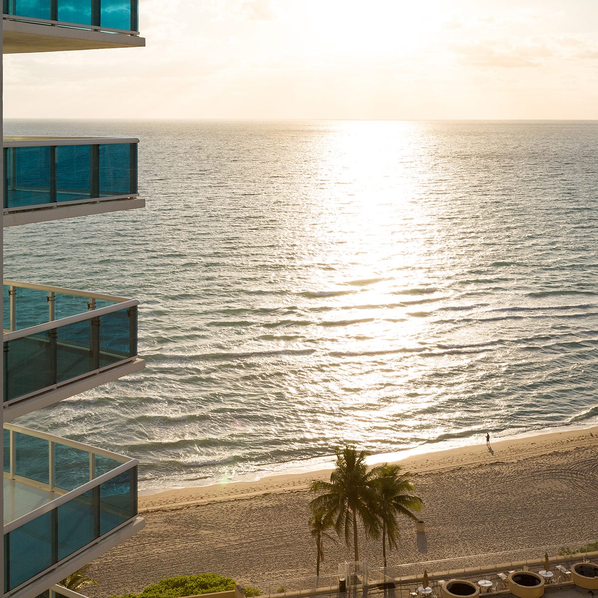
SpainLomat operates at the intersection of property services — helping clients find holiday homes, long‑term rentals, and properties for sale in Spain. Our strategy focused on expressing this duality clearly and confidently.
The creative direction was built around four key pillars:
- Trust & reliability — a professional partner in a foreign market
- Sun‑drenched coastal lifestyle — the Costa del Sol experience.
- Maritime atmosphere — sea, openness, and calm
- Easy vibe — effortlessness, clarity, and approachability
These elements guided every design decision, from form language to color and typography.
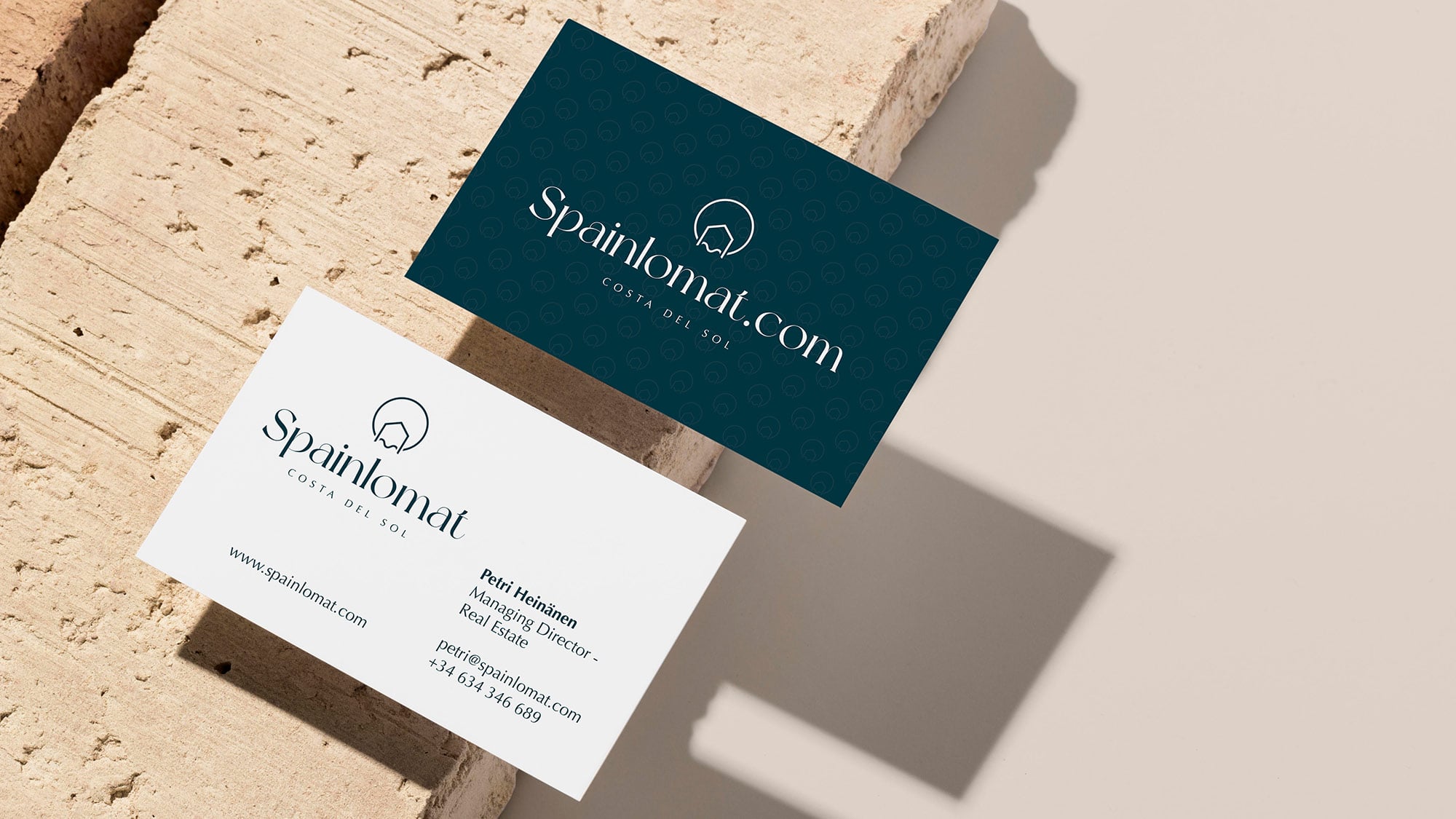
03 — LogoRedesign
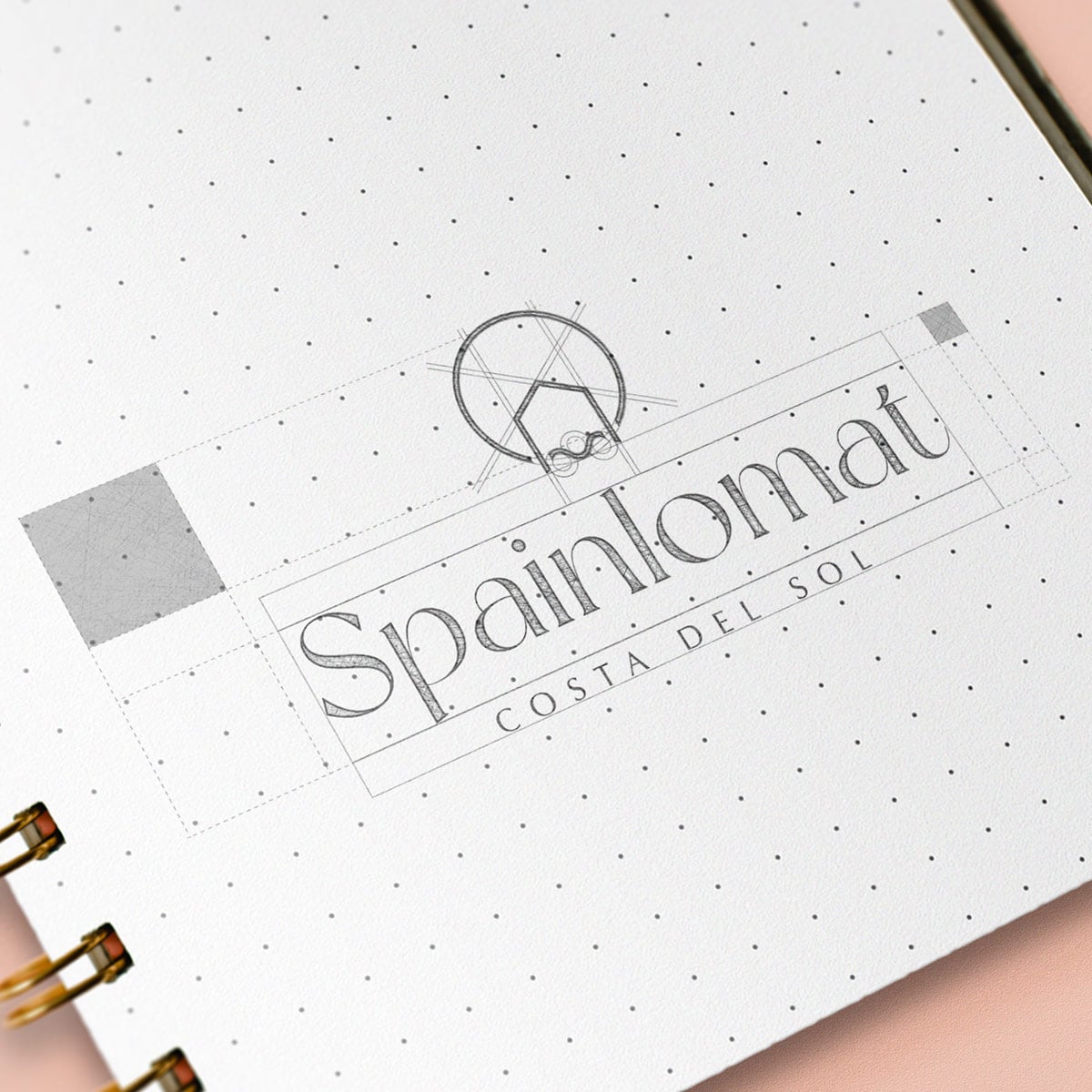
The new SpainLomat logo was designed to be clean, modern, and long‑lasting.
Key characteristics of the logo include:
- Balanced proportions that communicate stability and trust
- Subtle visual references to the sun and coastline, evoking the Costa del Sol
- A calm, maritime feel that reflects the Mediterranean environment
- A light, effortless expression that supports an “easy holiday” mindset
The result is a logo that feels both professional and relaxed — equally suitable for property transactions and lifestyle‑driven communication.
04 — Visual Identity & Digital Application
The renewed visual identity was designed to scale seamlessly across digital platforms, with a strong emphasis on clarity and usability.
The identity system includes:
- A harmonious color palette inspired by sea, sky, and sun
- Typography that balances readability with character
- A visual rhythm that supports browsing and discovery
- Consistent application across website layouts and brand assets
This ensures SpainLomat’s brand feels coherent, trustworthy, and instantly recognizable across all digital touchpoints.
05 — Outcome
The rebranding delivered:
- A modern, timeless logo that reflects SpainLomat’s values
- A clear and confident visual presence for digital channels
- Stronger emotional connection to the Costa del Sol lifestyle
- A professional identity that builds trust with international clients
- A visual system ready for long‑term growth and expansion
The new brand identity positions SpainLomat as a reliable local expert with an international outlook — combining professionalism with the relaxed rhythm of coastal living.
Conclusion
SpainLomat’s rebranding demonstrates Digital Priority’s ability to translate brand values, business goals, and environment into a cohesive and expressive visual identity.
By blending strategic thinking with refined visual design, the project resulted in a identity that feels credible, contemporary, and effortlessly Mediterranean — built to endure and evolve with the business.
Visit:Spainlomat